
This week, I’m doing a set of 3 short articles that explore some more advanced, concrete ideas around custom transitions. I give some additional context in the first one, so you may want to take a gander if you haven’t already:
Mastering view controller transitions, part 1: make them reusable
Mastering view controller transitions, part 2: make them feel natural
As a quick refresher, here’s an example of the transitions we introduced in the first article, and that all this writing is based on:
Okay, you’re up to speed! Let’s dive into the third and final goal.
Goal 3: I want my presented view controller to be able to easily define and adjust its own size
As I’ve mentioned in the past couple articles, it was really important to me in building these transitions that they were easy to reuse in different contexts. That means that if I’m building a simple presentation that slides in from the bottom, I certainly don’t want every view controller that uses it to be locked to one specific size — the size should depend on the content! — and I also don’t want to have to think too hard about setting the size appropriately every time I use my custom transition with a new view controller.
On top of that, I also quickly realized that it was important for me to be able to change the size of my view controllers while they were presented — as the content inside a presented view controller changed based on user input, I wanted the view controller to be able to grow or shrink to accommodate the content updates. (You can see this happening as tags and notes are added to the “Add game” view in the video above.)
Ultimately, we can accomplish all this (and more!) with the help of Auto Layout, a simple custom presentation controller, and the CustomPresentable protocol we’ve been using in the past two articles.
The first thing we’ll need to make sure of is this: our presented view needs to have its constraints set up such that they fully define the presented view’s height. In other words, there needs to be an unbroken chain of constraints and subviews stretching from the top edge to the bottom edge of the presented view.
To make sure that point is clear, let’s start by looking at a somewhat contrived example. Imagine we’re just trying to present a view that contains a big rectangle with a smaller button underneath. One way we might set up constraints is like this:
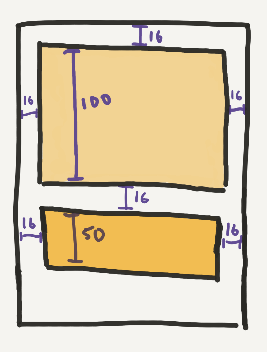
This is a valid set of constraints — if you installed these in a full-screen view, you’d get a rectangle and button at the top of the view as expected. But, these constraints don’t explicitly define the height of their superview, because there’s no bottom constraint; there could be any amount of space between the bottom of the button and the bottom of its superview, and these constraints would be satisfied.
Similarly, this is another valid set of constraints:
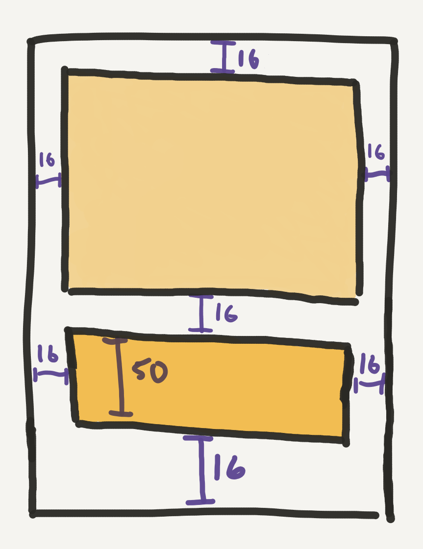
If you installed these in a full-screen view, the rectangle would fill most of the screen, with the button sitting at the bottom. But these constraints don’t explicitly define the height of their superview either, because the rectangle view has no height constraint; these constraints could be satisfied in a superview of any height, because the height of the rectangle will simply adjust accordingly.
What we need is this:
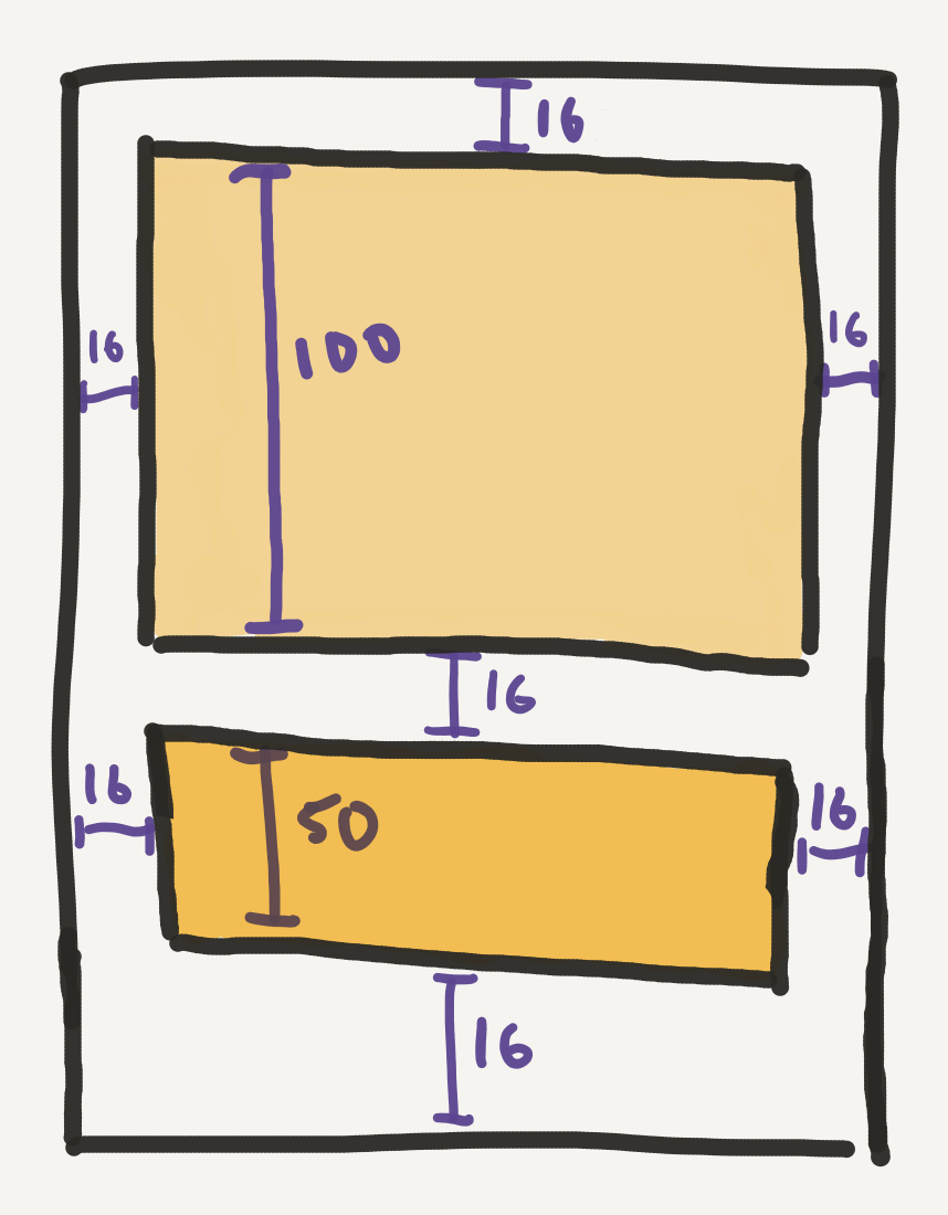
In this situation, the constraints will only be satisfied if the superview is exactly 198 points tall: 100 for the rectangle, 50 for the button, and 16x3 for the top, bottom and in-between spaces. Of course, if we tried to install these constraints in a full-screen view, the constraints would break, since an iPhone screen isn’t 198 points tall. But this is actually exactly what we want: our constraints now define exactly what the height of their superview should be, and we’ll be able to use that fact to ensure that our presented view is sized correctly.
Next, we’ll set up our custom presentation controller. The presentation controller is responsible for defining what the frame of the presented view should actually be. It’ll do this by defining a constant width that all presented views should have, and then using that to calculate what the presented view’s height should be, based on its content and constraints.
Luckily, UIKit makes it pretty easy to do this. We’ll need to override a function and a variable in our custom presentation controller to get this to work:
override func containerViewWillLayoutSubviews() {
  presentedView?.frame = frameOfPresentedViewInContainerView
}

override var frameOfPresentedViewInContainerView: CGRect {
  guard let containerView = containerView, let presentedView = presentedView else { return .zero }

  let inset: CGFloat = 16
  let safeAreaFrame = containerView.bounds.inset(by: containerView.safeAreaInsets)

  let targetWidth = safeAreaFrame.width - 2 * inset
  let fittingSize = CGSize(
    width: targetWidth,
    height: UIView.layoutFittingCompressedSize.height
  )

  let targetHeight = presentedView.systemLayoutSizeFitting(
    fittingSize,
    withHorizontalFittingPriority: .required,
    verticalFittingPriority: .defaultLow
  ).height

  var frame = safeAreaFrame
  frame.origin.x += inset
  frame.origin.y += 8.0
  frame.size.width = targetWidth
  frame.size.height = targetHeight

  return frame
}
Note: credit for the code above goes to Kyle Bashour, whose excellent article helped me figure this out 🙏
In frameOfPresentedViewInContainerView, we first figure out what the width of the presented view should be, based on our desire to have it inset 16 points from either side of the screen. The next part — setting a fittingSize and then calling systemLayoutSizeFitting — essentially amounts to us asking UIKit the following: given our target width, what’s the smallest height that the presented view could have that satisfies all its internal constraints? (In our rectangle and button example above, we’d get 198 as our targetHeight.) We then position the frame where we want it to be, give it the size we calculated, and return it.
When our presentation kicks off and the container view is about to layout its subviews, containerViewWillLayoutSubviews gets called. This gives us the chance to use frameOfPresentedViewInContainerView to assign a frame with the correct width and height to our presented view before it gets presented. When all is said and done, we get something like this:
Just like that, we now have the ability to present a view controller of any size, as long as that view controller’s view defines its own height with constraints. However, we’re still missing a big piece of the puzzle: this doesn’t currently account for any changes in the presented view controller’s content after it’s been presented. A change in the layout of our presented view doesn’t automatically trigger containerViewWillLayoutSubviews, which means we don’t have a chance to re-calculate and re-assign frameOfPresentedViewInContainerView. No big deal; we’ll just have to trigger it ourselves.
One approach we can take to make this kind of dynamic layout update simple and reusable is to add this functionality to our CustomPresentable protocol — a protocol that our presented view controllers are already required to conform to. Let’s update CustomPresentable to look something like this:
protocol CustomPresentable: UIViewController {
  var transitionManager: UIViewControllerTransitioningDelegate? { get set }
  var dismissalHandlingScrollView: UIScrollView? { get }
  func updatePresentationLayout(animated: Bool)
}

extension CustomPresentable {
  var dismissalHandlingScrollView: UIScrollView? { nil }

  func updatePresentationLayout(animated: Bool = false) {
    presentationController?.containerView?.setNeedsLayout()
    if animated {
      UIView.animate(withDuration: 0.3, delay: 0.0, usingSpringWithDamping: 1.0, initialSpringVelocity: 0.0, options: .allowUserInteraction, animations: {
        self.presentationController?.containerView?.layoutIfNeeded()
      }, completion: nil)
    } else {
      presentationController?.containerView?.layoutIfNeeded()
    }
  }
}
Here, we’ve used the new Swift 5 feature that allows protocols to “inherit” from classes — enforcing that any class that conforms to CustomPresentable is a view controller. This then allows us to provide a default implementation for our new function, updatePresentationLayout(animated:), via protocol extension. This function simply marks our presentation controller’s container view as needing a layout update, and then performs the layout update, animating it if requested.
Now, whenever something happens in our presented view controller’s layout that requires a size change, we can call updatePresentationLayout(animated:) to update the presented view’s frame. In the case of our simple rectangle example, we can respond to the button tap like this:
@objc private func changeSizeButtonTapped() {
  rectangleHeightConstraint.constant = CGFloat(Int.random(in: 50...400))
  updatePresentationLayout(animated: true)
}
Here, we simply change the height of the rectangle to a random value, and then call updatePresentationLayout(animated: true) to perform the update. Here’s what that looks like:
This is a simple example, but the exact same principles are applied in the more complex transitions shown in the video at the top. For example, when the “Notes” button is tapped to reveal the text input view, that text input view’s isHidden property is set to false; since it’s arranged inside a stack view, the stack view automatically reveals the view and adjusts its own intrinsic size; and then I simply call updatePresentationLayout(animated: true) to give my presentation controller a chance to resize the presented view based on these internal changes.
Note: Sometimes, the Auto Layout engine tries to update the layout of your presented view before the view’s frame has a chance to update, which will cause constraint conflicts if the views and constraints in your presented view no longer fit properly inside the old frame. A simple way to deal with this is to lower the priority of your bottom-most constraint to 999, which gives Auto Layout a bit of flexibility to properly sort things out when your layout is changing.
Wrap-up
Once you wrap your head around what the role of a custom presentation controller should be, there are a whole bunch of interesting things you can start do with it. In my custom transitions, my presentation controller is responsible for detecting the appearance of the keyboard, and adjusting the positioning of the presented view based on the keyboard’s frame. It communicates with the presented view controller (via CustomPresentable) to ensure that the current first responder is always visible between the top of the screen and the top of the keyboard. It also uses CustomPresentable to hide the status bar whenever the presented view is shifted beyond the top of the screen. You can see all this in action in the video at the top, as I start adding notes to my “Undertale” entry.
I’d love to share some of those implementation details another day; regardless, my hope at this point is that, having read this little series on custom view controller transitions, you now have all the tools you need to get creative and build your own fun, reusable, well-polished view controller transitions. It’s a tricky little API, but if you put a bit of effort into understanding it up front, it really does open up possibilities that otherwise might have felt overwhelmingly difficult or tedious to build.
So…go build something awesome! 🦸
For a working example of the techniques described here and in the other two articles in this series on custom view controller transitions, check out this repo on GitHub.
Thanks a bunch for following along. This is a relatively quick look at a pretty tricky topic, so if you need some help or have any follow-up questions, Let me know! Find me on Twitter here 🦆