I mulled over a bunch of different ways to introduce this post — “There’s not enough whimsy on the App Store!”, “Unique animations can take your app from good to great!”, “Doctors hate this one weird trick to make your buttons utterly delightful!”, etc. — but I decided they didn’t really serve much of a purpose, so I’m going to get straight to the point:
You, I imagine: “Is there a way for me to build compelling, animated interactions into my app relatively quickly, using tools I’m already super familiar with?
Me, boldly and with great enthusiasm: “Yes!”
I’ve been having fun messing around with custom controls recently, and I thought it’d be worthwhile to walk through how, with a bit of creativity, we can build a nicely animated — and dare I say, whimsical — button using nothing but views, layout constraints and some simple transformations. There are certainly more flexible, and perhaps more elegant, ways to go about building animated interactions, but I’ve run into many cases where this simple approach does just what I need with very little effort. And hey, they say constraints breed creativity; by operating primarily at the UIKit layer, we’re certainly working within some tight constraints here. Let’s give it a shot!
What I want to build
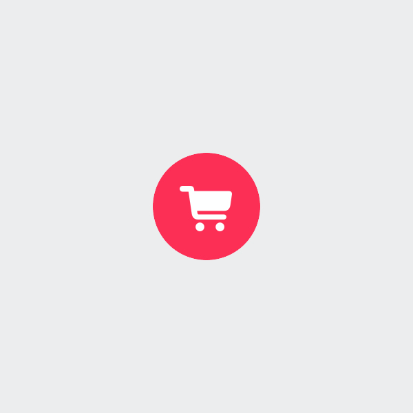
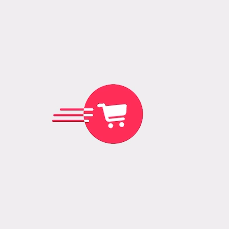
I want a brightly coloured, round button with a shopping cart icon. I want the cart to look fast; so fast, in fact, that the speed lines extend beyond the button itself. When the button is tapped, I want the shopping cart to sort of wind up — think, like, a horse rearing up, or a motorcycle doing a wheelie, or one of those pull-back toy cars — and then zoom away, straight off the edge of the button.
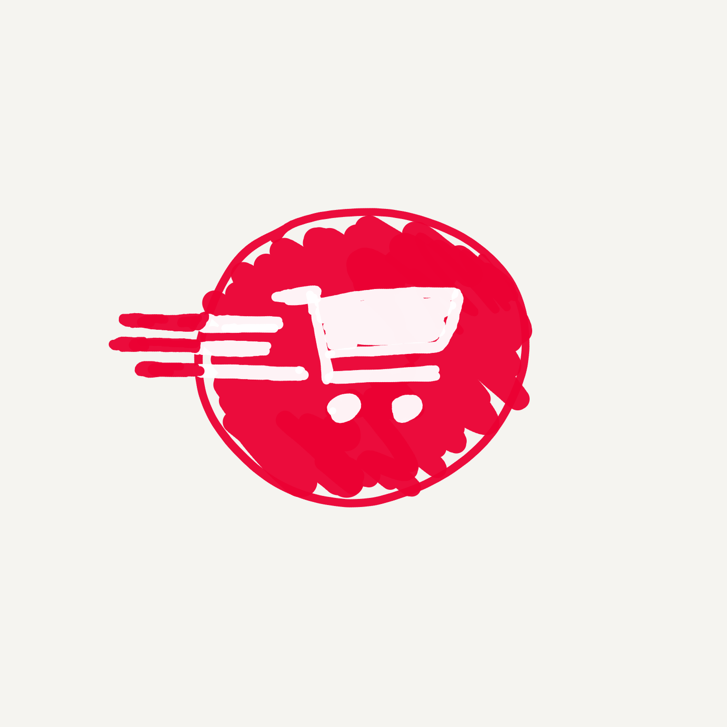
Kind of like this, but better.
Why do I want these things, you ask? Because I think the end result will be rather amusing. Let’s do it for the whimsy.
🛒💨💨💨
Step 1: Subclassing UIControl
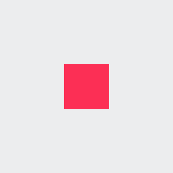
First, let’s create our new button. We’ll subclass UI Control, and call it FastCartButton, to remind ourselves that this cart is WICKED fast. This button is intended for a very specific use case, so we’re happy to have the control define its own specific size. We’ll give the whole thing a background colour for now so we can see it on screen.
class FastCartButton: UIControl {
    init() {
        super.init(frame: .zero)
        constrain(self) {
            $0.width == 52
            $0.height == 52
        }
        backgroundColor = .systemPink
    }
}
Note: in the example above, and throughout my examples, I’m using Cartography — a simple Auto Layout DSL that makes setting and modifying constraints a bit more clean and concise. Even if you’re not familiar with Cartography, the constraints I use are simple and the code should be fairly self-explanatory. One shortcut Cartography provides is that it always ensures translatesAutoresizingMaskIntoConstraints is set to false when constraints are added; if you’re following along with vanilla Auto Layout syntax, don’t forget to set that property yourself.
Throw a new FastCartButton into a view, centre it, and voilà: a pink square on a screen!
It’s worth noting that you could add a touchUpInside target to your instance of FastCartButton, and it would trigger as expected — UIControl handles those events for us out of the box. However, inside FastCartButton, we can also hook into a few touch tracking functions to gain some finer control over the user’s interaction with the button:
override func beginTracking(_ touch: UITouch, with event: UIEvent?) -> Bool {
    print("begin")
    return true
}

override func continueTracking(_ touch: UITouch, with event: UIEvent?) -> Bool {
    print("continue")
    return true
}

override func endTracking(_ touch: UITouch?, with event: UIEvent?) {
    super.endTracking(touch, with: event)
    print("end")
}

override func cancelTracking(with event: UIEvent?) {
    super.cancelTracking(with: event)
    print("cancel")
}
Now when you tap the pink square, drag around and release, you can see that these functions get called at pretty self-explanatory times. We’re now all set up and ready to use these functions as triggers for some fun animations…but first we need some views to animate.
Step 2: Adding subviews
If we think through the basic requirements I outlined in “What I want to build”, we can figure out what kind of view hierarchy is needed to build this thing. The crux of it is probably those speed lines: how do we get those lines to seamlessly flow off the button and onto the background, changing colour along the way?
Well, here’s a dumb, easy answer: let’s use two sets of lines, in two different superviews! The pink lines will be children of the root superview (which won’t clip to its bounds), and they’ll be partially hidden by the pink circular “button” view. The white lines will be children of that button view, and will be clipped by its edge. The cart image will also be a subview of the button view, so that it too can be clipped as it races off the side of the button. That’s all we should need. Let’s set it up.
First, let’s initialize all our subviews:
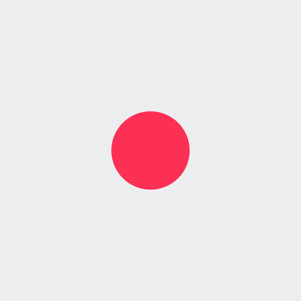
let buttonView: UIView = .make(backgroundColor: .systemPink, height: 52.0, width: 52.0, cornerRadius: 26.0)
let imageView: UIImageView = .make(image: UIImage(systemName: "cart.fill", withConfiguration: UIImage.SymbolConfiguration(pointSize: 22.0, weight: .bold, scale: .default)), tintColor: .white)
let topWhiteLine: UIView = .make(backgroundColor: .white, height: 2.0, cornerRadius: 1.0)
let middleWhiteLine: UIView = .make(backgroundColor: .white, height: 2.0, cornerRadius: 1.0)
let bottomWhiteLine: UIView = .make(backgroundColor: .white, height: 2.0, cornerRadius: 1.0)
let topPinkLine: UIView = .make(backgroundColor: .systemPink, height: 2.0, cornerRadius: 1.0)
let middlePinkLine: UIView = .make(backgroundColor: .systemPink, height: 2.0, cornerRadius: 1.0)
let bottomPinkLine: UIView = .make(backgroundColor: .systemPink, height: 2.0, cornerRadius: 1.0)
Note: I’m using some simple factory methods here to make things more readable. There’s no magic here; they do exactly what you’d expect based on the parameters I’m passing in.
Now, let’s do some additional configuration and lay them out, piece by piece, by calling setUpView() from our initializer.
init() {
    // ...
    setUpView()
}

private func setUpView() {
    backgroundColor = .clear
    setUpButton()
    setUpImageView()
    setUpWhiteLines()
    setUpPinkLines()
}
First let’s implement setUpButton:
private func setUpButton() {
        buttonView.isUserInteractionEnabled = false
        buttonView.clipsToBounds = true
        addSubview(buttonView)
        constrain(buttonView) {
            $0.center == $0.superview!.center
        }
    }
There’s our pink button view. We set this view’s isUserInteractionEnabled to false (along with all our other subviews) to make sure the UIControl itself handles touch inputs.
Next let’s add the cart:
private func setUpImageView() {
    imageView.isUserInteractionEnabled = false
    buttonView.addSubview(imageView)

    constrain(imageView) {
        imageViewCenterXConstraint = ($0.centerX == $0.superview!.centerX)
        $0.centerY == $0.superview!.centerY
    }
}
Note: imageViewCenterXConstraint is just a property I’ve defined of type NSLayoutConstraint. We’re holding onto this constraint so that we can animate it later.
Easy peasy. Then our white lines:
private func setUpWhiteLines() {
        topWhiteLine.isUserInteractionEnabled = false
        middleWhiteLine.isUserInteractionEnabled = false
        bottomWhiteLine.isUserInteractionEnabled = false

        lineWidthConstraintGroup = constrain(topWhiteLine, middleWhiteLine, bottomWhiteLine) {
            $0.width == 24
            $1.width == 24
            $2.width == 24
        }

        buttonView.addSubview(topWhiteLine)
        buttonView.addSubview(middleWhiteLine)
        buttonView.addSubview(bottomWhiteLine)

        lineTrailingConstraintGroup = constrain(topWhiteLine, middleWhiteLine, bottomWhiteLine) {
            $0.trailing == $0.superview!.leading + 11.0
            $1.trailing == $1.superview!.leading + 8.0
            $2.trailing == $2.superview!.leading + 14.0
        }

        constrain(topWhiteLine, middleWhiteLine, bottomWhiteLine) {
            $1.centerY == $1.superview!.centerY + 1.0
            $0.bottom == $1.top - 3.0
            $2.top == $1.bottom + 3.0
        }
    }
Note: Similarly, here we’re holding onto groups of constraints (lineWidthConstraintGroup and lineTrailingConstraintGroup) in order to animate changes to these groups later.
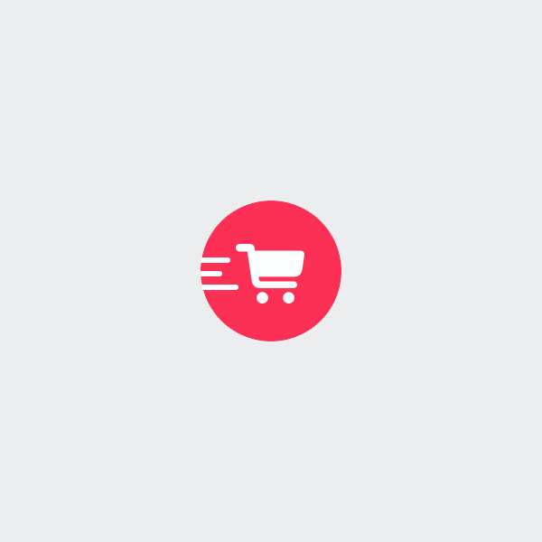
We assign the same width to each of these lines, but we vary the positioning of their right edges to create a bit of visual interest. We position them vertically relative to the cart, such that they’re equally spaced and complement the cart well.
Finally, let’s set up our pink lines:
private func setUpPinkLines() {
    topPinkLine.alpha = 0.6
    middlePinkLine.alpha = 0.6
    bottomPinkLine.alpha = 0.6

    insertSubview(topPinkLine, belowSubview: buttonView)
    insertSubview(middlePinkLine, belowSubview: buttonView)
    insertSubview(bottomPinkLine, belowSubview: buttonView)

    constrain(topPinkLine, topWhiteLine) {
        $0.width == $1.width
        $0.centerY == $1.centerY
        $0.trailing == $1.trailing
    }
    constrain(middlePinkLine, middleWhiteLine) {
        $0.width == $1.width
        $0.centerY == $1.centerY
        $0.trailing == $1.trailing
    }
    constrain(bottomPinkLine, bottomWhiteLine) {
        $0.width == $1.width
        $0.centerY == $1.centerY
        $0.trailing == $1.trailing
    }
}
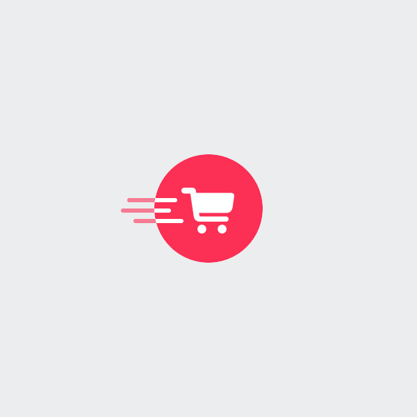
We reduce the alpha of these lines to make them a bit less prominent when the button is idle. Then we lay them out such that they each mirror the width and position of their corresponding white line. This way, it’ll be easy to treat each pair of lines as a single object when we get to animating.
Okay, on to the fun part!
Step 3: Animating our interactions
All that’s left to do is to use those tracking methods we stubbed out in step 1 to trigger some extremely whimsical animations. I like to structure things such that the button moves between different states as touches are tracked, and the animations trigger based on those states. To do that, let’s first define our states:
enum TouchState {
    case idle
    case down
    case up
    case cancelled
}
idle: no interactions or animations are occurring.
down: the button is currently pressed down.
up: the button was successfully released (i.e. touchUpInside was triggered).
cancelled: the button press was cancelled (i.e. the touch was dragged outside the button’s bounds).
Next, let’s create a property to track that state, and stub out our animations:
private var touchState: TouchState = .idle {
    didSet {
        guard touchState != oldValue else { return }
        switch touchState {
        case .down:
            performTouchDownAnimations()
        case .up:
            performTouchUpAnimations()
        case .cancelled:
            performTouchCancelledAnimations()
        case .idle:
            break
        }
    }
}

private func performTouchDownAnimations() {}
private func performTouchUpAnimations() {}
private func performTouchCancelledAnimations() {}
And then let’s properly override those tracking functions mentioned earlier to transition between states:
private var extendedBounds: CGRect { bounds.insetBy(dx: -70, dy: -70) }

override func beginTracking(_ touch: UITouch, with event: UIEvent?) -> Bool {
    guard touchState == .idle else { return false }
    touchState = .down
    return true
}

override func continueTracking(_ touch: UITouch, with event: UIEvent?) -> Bool {
    let point = touch.location(in: self)
    if extendedBounds.contains(point) {
        touchState = .down
    } else {
        touchState = .cancelled
    }
    return true
}

override func endTracking(_ touch: UITouch?, with event: UIEvent?) {
    super.endTracking(touch, with: event)
    if let point = touch?.location(in: self), extendedBounds.contains(point) {
        touchState = .up
    } else {
        touchState = .cancelled
    }
}

override func cancelTracking(with event: UIEvent?) {
    super.cancelTracking(with: event)
    touchState = .cancelled
}
One interesting thing to note here is that extendedBounds property. What’s that about? Basically, Apple has implemented UIControl in such a way that if a user taps a control, and then drags their finger away from the control a relatively small distance (<= about 70 points), UIControl still considers itself to be “pressed”, or highlighted; when the user then releases, a touchUpInside event is still triggered, even though the touch was no longer actually inside the control. We want our touch state and corresponding animations to reflect this, so we also consider our button to be in a “pressed” state when the touch is within those extended bounds.
Now, let’s animate! There’s nothing complicated going on in these animation functions; what’s interesting is how this series of uncomplicated animations ends up creating an effect that looks pretty fun and polished. There are a lot of magic numbers in here whose values are really just a product of imagining how something should look, and doing a bit of tweaking to land on something that looks and feels right to me. If things don’t look and feel quite right to you, feel free to tweak ‘em some more.
Note: I’ve included gifs of the animations slowed way down so you can see what’s going on. Stay tuned for the full-speed, finished product at the end.
Touch down animations
private func performTouchDownAnimations() {
    constrain(topWhiteLine, middleWhiteLine, bottomWhiteLine, replace: lineWidthConstraintGroup) {
        $0.width == 32.0 + CGFloat.random(in: -4.0...4.0)
        $1.width == 32.0 + CGFloat.random(in: -4.0...4.0)
        $2.width == 32.0 + CGFloat.random(in: -4.0...4.0)
    }

    constrain(topWhiteLine, middleWhiteLine, bottomWhiteLine, replace: lineTrailingConstraintGroup) {
        $0.trailing == $0.superview!.leading + 8.0 + CGFloat.random(in: -4.0...4.0)
        $1.trailing == $1.superview!.leading + 8.0 + CGFloat.random(in: -4.0...4.0)
        $2.trailing == $2.superview!.leading + 8.0 + CGFloat.random(in: -4.0...4.0)
    }

    UIView.animate(withDuration: 0.8, delay: 0.0, usingSpringWithDamping: 1.0, initialSpringVelocity: 0.0, options: .allowUserInteraction, animations: {
        self.layoutIfNeeded()
        self.topPinkLine.alpha = 1.0
        self.middlePinkLine.alpha = 1.0
        self.bottomPinkLine.alpha = 1.0
        self.imageView.transform = CGAffineTransform(rotationAngle: -0.1)
    }, completion: nil)
}
Although the majority of the time, users aren’t actually holding down buttons before releasing them, it’s nice to include a touch down animation that complements the main touch up animation. Here, I’m doing a few things:
- Rotating the cart image counterclockwise slightly, to give that horse rearing / wheelie impression I mentioned earlier.
- Making the pink lines opaque, which helps to distinguish the press-down state in a slightly more familiar way (i.e. adding colour).
- Making the lines a bit longer, and a bit further away from the cart, but in a way that includes some randomness in size and position. I’m not sure this makes a whole lot of physical sense — elongating the lines kind of implies the cart is moving faster, when in fact it’s just getting ready to actually move — but ultimately it creates a bit of anticipation, and I like the look of it ¯\_(ツ)_/¯
Touch cancelled animations
private func performTouchCancelledAnimations() {
    constrain(topWhiteLine, middleWhiteLine, bottomWhiteLine, replace: lineWidthConstraintGroup) {
        $0.width == 24.0
        $1.width == 24.0
        $2.width == 24.0
    }

    constrain(topWhiteLine, middleWhiteLine, bottomWhiteLine, replace: lineTrailingConstraintGroup) {
        $0.trailing == $0.superview!.leading + 11.0
        $1.trailing == $1.superview!.leading + 8.0
        $2.trailing == $2.superview!.leading + 14.0
    }

    imageViewCenterXConstraint.constant = 0.0

    UIView.animate(withDuration: 0.3, delay: 0.0, usingSpringWithDamping: 1.0, initialSpringVelocity: 0.0, options: .allowUserInteraction, animations: {
        self.layoutIfNeeded()
        self.topPinkLine.alpha = 0.6
        self.middlePinkLine.alpha = 0.6
        self.bottomPinkLine.alpha = 0.6
        self.imageView.transform = .identity
    }, completion: { _ in
        self.touchState = .idle
    })
}
There’s nothing particularly special about this one — it’s just used to get the views back to their idle state when necessary, e.g. if the users taps and holds the button, but then drags away to cancel the button press. Note that this function is responsible for moving the touchState back to idle when the animation has completed.
Touch up animations
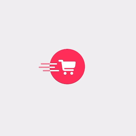
private func performTouchUpAnimations() {
    UIView.animateKeyframes(withDuration: 0.8, delay: 0.0, options: [.allowUserInteraction, .calculationModeCubic, .beginFromCurrentState], animations: {
        // 1
        UIView.addKeyframe(withRelativeStartTime: 0.0, relativeDuration: 0.35) {
            self.imageViewCenterXConstraint.constant = -4.0
            self.imageView.transform = CGAffineTransform(rotationAngle: -0.15)

            constrain(self.topWhiteLine, self.middleWhiteLine, self.bottomWhiteLine, replace: self.lineTrailingConstraintGroup) {
                $0.trailing == $0.superview!.leading + 2.0 + CGFloat.random(in: -4.0...4.0)
                $1.trailing == $0.superview!.leading + 2.0 + CGFloat.random(in: -4.0...4.0)
                $2.trailing == $0.superview!.leading + 2.0 + CGFloat.random(in: -4.0...4.0)
            }
            self.layoutIfNeeded()
        }
        // 2
        UIView.addKeyframe(withRelativeStartTime: 0.35, relativeDuration: 0.04) {
            self.imageView.transform = .identity
        }
        // 3
        UIView.addKeyframe(withRelativeStartTime: 0.35, relativeDuration: 0.5) {
            self.imageViewCenterXConstraint.constant = 104.0
            self.layoutIfNeeded()
        }
        // 4
        UIView.addKeyframe(withRelativeStartTime: 0.4, relativeDuration: 0.5) {
            constrain(self.topWhiteLine, self.middleWhiteLine, self.bottomWhiteLine, replace: self.lineTrailingConstraintGroup) {
                $0.trailing == $0.superview!.leading + 104.0
                $1.trailing == $0.superview!.leading + 104.0
                $2.trailing == $0.superview!.leading + 104.0
            }

            constrain(self.topWhiteLine, self.middleWhiteLine, self.bottomWhiteLine, replace: self.lineWidthConstraintGroup) {
                $0.width == 48.0 + CGFloat.random(in: -4.0...4.0)
                $1.width == 48.0 + CGFloat.random(in: -4.0...4.0)
                $2.width == 48.0 + CGFloat.random(in: -4.0...4.0)
            }

            self.layoutIfNeeded()
        }
        // 5
        UIView.addKeyframe(withRelativeStartTime: 0.45, relativeDuration: 0.2) {
            self.topPinkLine.alpha = 0.0
            self.middlePinkLine.alpha = 0.0
            self.bottomPinkLine.alpha = 0.0
        }

    }, completion: { _ in
        self.touchState = .idle
    })
}
Here’s the big one! I used keyframe animations here, since this isn’t just a point A to point B animation. The keyframe animation includes a couple important options:
calculationModeCubic: this basically describes how iOS will blend the animations of the various keyframes together. In this case, if one keyframe moves an object in one direction, and the next moves that object in a different direction, iOS will overshoot the first animation as it smoothly transitions into the next. There are other keyframe animation options that combine the animations in different ways; this one worked well here.beginFromCurrentState: this is crucial in order for this animation to occur smoothly regardless of how much progress has been made in the touch down animation when the touch up animation is triggered.
I’ve numbered each keyframe in comments above. Here’s what’s going on in each:
- To begin, we pull back the cart slightly, rotate it counterclockwise (a little further than we did on touch down), and pull the lines back a bit in tandem with the cart.
- As soon as the cart starts moving forward, we quickly rotate the cart back to its resting position, which gives the impression of the cart “thunking” back down onto its 4 wheels as it takes off.
- Here we’re actually moving the cart to the right, off the edge of the button.
- We also move the lines to the right, to follow the cart off the edge of the button. This keyframe starts slightly after the cart starts moving, which helps give the impression of speed: the cart takes off so fast that the lines lag behind a bit. As the lines move to the right, they also elongate in a slightly random way. This also creates the impression of speed — almost like the back of the lines lagged behind even more than the front — and the randomness gives a bit of visual interest as the tail-end of the lines fly off the edge.
- Finally, we’re simply fading out the pink lines just fast enough that by the time their leading edges reach the right edge of the button, they’re no longer visible. Otherwise, we’d see the pink lines appear on the right side of the button.
Note: I omitted some code that properly gets the views back into an idle state for the sake of brevity. How exactly you’d want to do that would likely depend on what your use case is for this very specific button.
Here’s the final product at a more usable speed:
Zoom zoom.
Our shopping cart speeds away in a pretty fun and lively way, and we did it entirely with UIViews, UIView animation blocks, basic layout constraints and a simple rotation transformation. Pretty cool!
Is there a more elegant or efficient way to do this? Could I have made this look more fun and lively using other tools? Maybe. But this was a piece of cake to put together, and it works well. If there’s any one thing I hope to have communicated here, it’s that sometimes you can accomplish more than you think with a really basic and comfortable set of tools. And I’d even go so far as to say that the constraints those basic tools impose can actually help you think creatively and come up with ideas you didn’t know you had.
So go ahead: have some fun and crank your app’s whimsy levels up a notch 💫